XBRL and Visualization for Big Data Analysis
XBRL in India has come a long way from the time since it was implemented by the Government regulators in India, namely the Ministry of Corporate Affairs, Reserve Bank of India and the major Stock Exchanges (National Stock Exchange and Bombay Stock Exchange). At this point, the public companies see the XBRL mandate as a compliance burden rather than as a value-added tool for analysis. Regulators in India have XBRL tagged data available. What are they doing with it?
XBRL Tagged Data for Big Data Analysis
Regulators such as the Ministry of Corporate Affairs (MCA) should start using the XBRL database to solve the headache of big data analysis. Today organizations and their regulatory bodies are drowning in the data ocean, leading to issues with long processing time, error reconciliation, re-working to clean the data and data analysis. XBRL can resolve the problems. Standardized reporting language and processes can help business leaders make informed decisions based on meaningful data, which would lead to improved risk management. It would also save time on data collation, allowing for prompt action to be taken.
IT systems captures data (ERP systems and accounting systems), an entity prepares it (CFOs and their teams) and another labels the data (XBRL accountants), auditors make sure the labels are correct and finally another entity ensures that this entire process was in accordance with the MCAs Validation System. Regulators in India thus have the entire processed and structured data. All they have to do is to figure out how to model this data and prepare graphical representations that investors and analysts should have at their fingertips.
Today investors, analysts and leaders in organizations have adopted data analytics at all levels of the decision-making process. Analytics is proving useful for best-in-class performing global companies by not just providing insights to key management personnel and analysts, but as a model for corporate behavior that can positively impact all key users in the way they gain insights and make better decisions. The result of the analytics processes should not be restricted to only one kind of user or to a small number of users and, of course, they should not be very difficult to understand.
To make analytics more meaningful, data visualization is the key. Data visualization refers to the graphical or pictorial representation of the data. It helps to understand the huge amount of data and get an insight from what could even be terabytes of data. Studies show that the human brain is much faster in processing the data points when they are presented in charts and graphs rather than data-loaded spreadsheets or reading pages and pages of reports. Aesthetics and functionality need to go hand in hand to make the analysis outcome more effective. The ultimate objective is to effectively communicate key aspects of complex datasets in an intuitive manner in order to facilitate arriving at insights. As more and more data is collected and analyzed, regulators and business leaders at all levels require visualization software that enable them to see the analysis results presented graphically.
The following example illustrates how visualizations can help analyze data easily:
![]()
It is very difficult to gather the month-to-month variation in the three numbers from the above table at a glance. The graphical representation of the same data will give users better “ and quicker “ insight.
These column charts allow users to easily compare revenues and expenses for a number of periods. An additional profit/loss line chart has been added that illustrates which month has logged the maximum profit.
The user can also choose another graph type for better aesthetics.
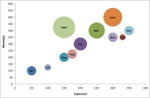
The height of the bubble indicates the revenue, the distance from the left indicates expenses, and the size of the bubble indicates profit.
This helps decision makers find relevant variables from millions of data elements, project insights, establish concepts and formulate hypotheses to other stakeholders, and even make reliable forecasts. An optimum combination of high-performance analytics and easy-to-use visualization software is the way to handle the big data explosion. XBRL-enriched data can ease the pain, if the regulators and companies use visualization tools to get insights from such data.
How DataTracks can help you?
DataTracks is a global leader in the preparation of financial statements in XBRL and iXBRL formats for filing with regulators. We also provide Software (SaaS) and Template solutions for those who would like to convert XBRL files themselves. DataTracks prepares more than 12,000 XBRL statements annually for filing with regulators such as SEC in the United States, HMRC in the United Kingdom, Revenue in Ireland ACRA in Singapore and MCA in India. DataTracks provides world-class services with its team of certified accountants experienced in US GAAP, UK GAAP, India GAAP and IFRS.
To find out more about DataTracks, www.datatracks.in or send an email to enquiry@datatracks.in
The views expressed are that of the authors and DataTracks is not responsible for the contents or views expressed therein. If any part of this blog is incorrect, inappropriate or violates the IP rights of any person or organization, please alert us at ceo@datatracks.com. We will take immediate action to correct any violation.